In Ghana, many students attend schools with little to no internet access. Yet in 9th grade, they’re expected to take a critical basic education exam that determines whether they move on to secondary or vocational school. Missing such an opportunity can lead to cyclical, generational poverty in rural regions of Ghana.
Students at the Semanhyiya American School in Senase, Ghana. (Photo: GodFreds Organization)
No access = no practice = no opportunities. That’s the equation we were determined to change.
How might we… support elementary-age Ghanian students in building critical digital literacy skills, even in offline settings?
The Schoolhouse project has been funded for multiple years by the Jacobs School of Engineering in partnership with the GodFreds Foundation and the Semanhyia American School in Senase, Ghana. Although Schoolhouse Ghana had been running for years, this was the first time the project had a dedicated UX design team — a.k.a. me and one other designer!
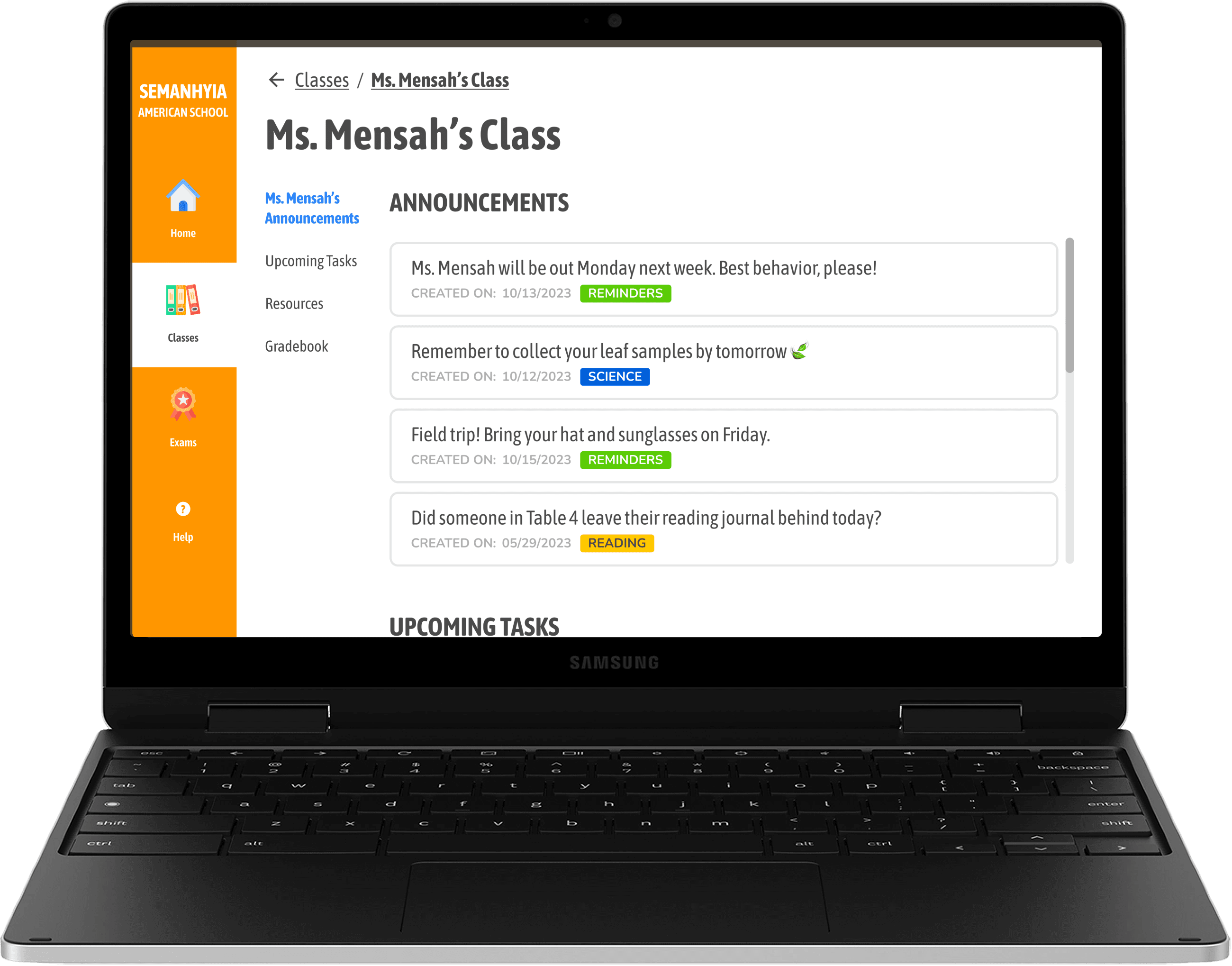
We inherited a working prototype (see above) but saw plenty of opportunity to reimagine the structure, visuals, and flows to make the system intuitive and delightful.
A browser-based learning platform powered by a local area network, with:
📡 A server and NAS device
📥 Downloadable content via USB
🖥 An intuitive educational interface
This system would allow students and teachers to practice key digital skills anytime, without needing an internet connection.
Our design critique surfaced key issues in information hierarchy, visual consistency, and navigation logic. From there, we prioritized:
✅ A unified design system with intentional color and type
✅ Cleaner relationships between classes, users, and roles
✅ A curriculum upload system to encourage teacher engagement
✅ Admin tools for managing classrooms and users
To sync priorities across our workflow, we used the following tools and strategies :)
Design: Figma + FigJam 🖌️
Engineering: React + MongoDB 👩💻
Collaboration: Jira, Agile sprints, daily standups 🤝
Structure: Luis Ouriach’s numerical screen system for Figma & Git branching (1000 > 1100 > 1110…)
We found that numbered flows were far easier for both designers and developers to refer to. It helped us speak the same language, and cut down on Slack back-and-forth by a lot.
We built a clean, minimal visual system where color was used sparingly but meaningfully: to signal urgency, user roles, or types of content. Fonts were selected for maximum legibility and friendliness, especially for younger users new to computers. Here's a peek at our style foundations:
We began wireframing flows for our three user types (admins, teachers, and students) while mapping out access levels and permissions.
Here’s how those permissions broke down:
A feature’s complexity therefore depended on the user and their scope of access within the interface. Below is a user flow that maps out all of the steps an admin, like a principal or office administrator, would see when creating a new class.
Mapping out the core logic behind class creation, user account linkage, and content publishing clarified the overarching system logic for both designers and developers, and informed our interface hierarchy.
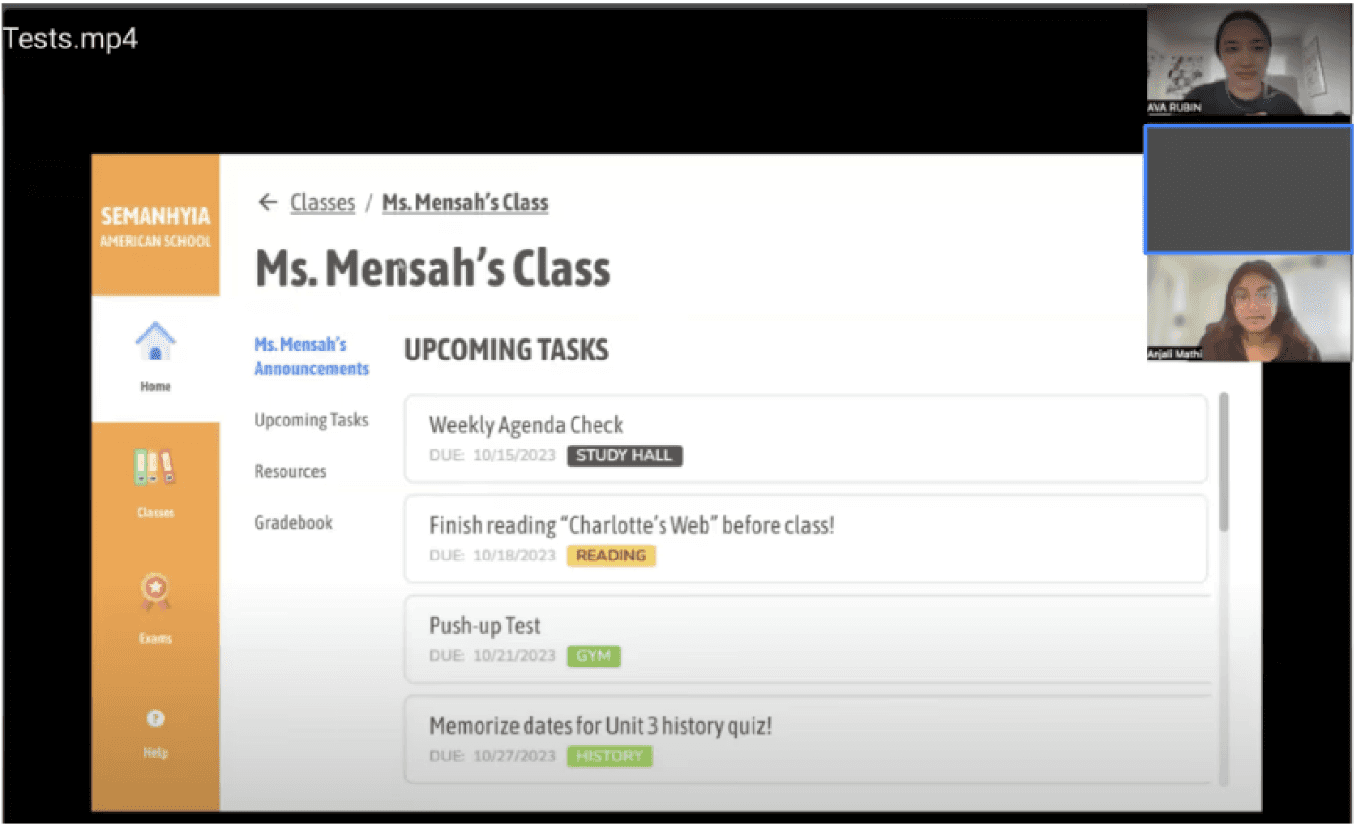
We tackled one of the most critical engagement points: class and curriculum pages where teachers could upload files, make announcements, and post assignments.
We designed views grouped by subject and by teacher, giving instructors flexible ways to manage educational content. Resources were color-coded and tagged for easy navigation.
Due to time zones and connectivity limitations, we weren’t able to test directly with our target users at Semanhyia American School, which made our process challenging: how would we approach designing for an audience with varying levels of technical proficiency that we couldn’t directly interact with or investigate?
Instead, we recruited 10 students aged 9–11 in the U.S. with varying levels of digital literacy to test basic functionality. We asked them to complete tasks as both a student and a teacher, using clickable prototypes.
What we learned:
✅ All users could use basic interactions (clicking, scrolling, drag/drop)
❌ Horizontal scrolling was confusing
❌ Lack of kid-friendly language; for example, "Assessments", "Assignments", and "Announcements" sounded way too similar
Going forward, we reaffirmed the importance of continuing to build with our target audience in mind; a kid at Semanhyia American School would not interact with our platform the same a tech-savvy kid in the U.S. would! We decided a welcoming, fun onboarding tutorial that walks new students through all of the important pages and interactions would be one of our top priorities for our next sprint.
🧠 Simplified language throughout—fewer syllables, more meaning
🧭 Onboarding tutorial added for student users
🎯 Reduced interface clutter, especially in student views
Designing for a kid in Ghana isn’t the same as designing for a kid in the Bay Area. We kept iterating with empathy and clarity as our north stars.
As our year came to a close, we documented every component, screen, and interaction for the next cohort of designers and developers. We also built out developer-ready Figma files, wrote a starter guide for onboarding, and ensured seamless alignment with engineering so the project could continue to evolve smoothly.
I'm very grateful to have collaborated with a mission-driven team and advisors who trusted us to bring this work to life! This project pushed us to get scrappy, stay collaborative, and never lose sight of the real-world stakes behind our interface.


